Roughly 88% of the world’s population lives in the northern hemisphere, and about half the world’s population lives north of 27°N. Taking the northern and southern hemispheres together, on average the world’s population lives 24 degrees from the equator.
World Population: Where it’s thick and where it’s thin
-The growing population of the world, now estimated to be over 7 billion, marks a global milestone and presents obvious challenges for the planet. (41 photos total)
Over-populated or under-developed? The real story of population growth
The world population looks set to reach 9.7 billion by 2050, but what’s behind the big numbers? We look at the complex demographic shifts in play Global population hit 7.3 billion midway through 2015, an increase of 2 billion since 1990.
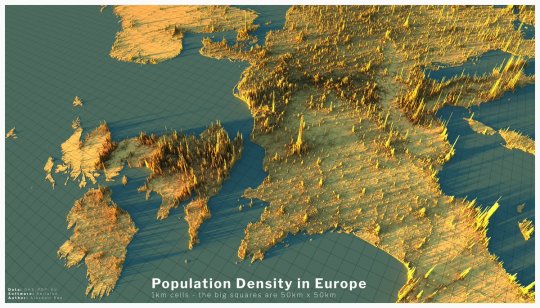
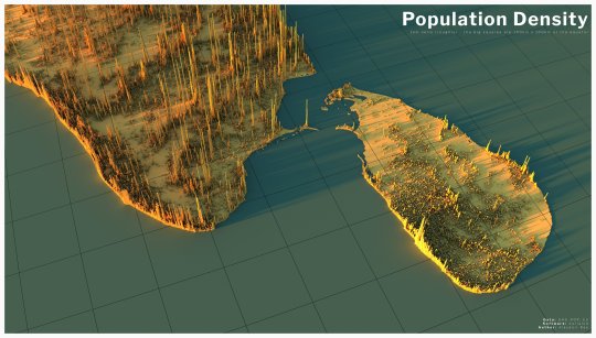
Global population density graphic made by Alasdair Rae founder ofAutomatic Knowledge. It shows world population density in 3d (approximately 7.8 billion people as of 2020), no land is shown on the map, only the locations where people actually live. The height of the spikes relates to the number of people living in an area, roughly 2Km x 2Km. Data/map prints are available here.
During the Summer 2014 Mami-City participated at an intensive workshop organised from the MoMa New York and the Mak in Vienna. Along with many great Universities like ETH Zürich, University of Cambridge and impressive offices like RUA Arquitetos and SITU we could help designing the exhibition. If you are interested in here you can find an article about the exhibition.
A visual narrative of major metageographical visions of the city, the urban and the world that animate contemporary discussion of world urbanization.
‘Urban’ World? is a project developed by Daniel Ibañez. Produced by: Daniel Ibañez & Roi Salgueiro. Voice over by: Azzurra Cox. Supported by: Urban Theory Lab, Harvard GSD [urbantheorylab.net] Special thanks to: Neil Brenner.
A lot of people may see a big group of cows and think that they’re being overcrowded- but are they. Cows are social animals and need friends to live. Researchers have found that cows develop lifelong friendships and I’ve been able to witness that firsthand seeing them with the same friends. Cows are herd animals and naturally live in large groups. It’s all about Cowmunity
When given a choice, cows will voluntarily crowd themselves in small areas. They feel safer in a group and won’t stray far from the main herd. You will rarely see a cow off by herself- though there is a loner in every group.
In the 1800s, pioneers and settlers traveling the midwestern plains of North America seen the wild bison herds. Some researchers have concluded that the bison population reached 300 million animals. For perspective, there is only 9 million dairy cows in the US today. The strange thing is that even though the bison had all the freedom in the world, they still chose to live in tight knit communities called herds.
I suppose people aren’t much different. When flying into LAX- Los Angeles you can see houses for miles around. People are also social beings and live in tight knit communities.
Doing rough math, people may be more crowded. Consider this- a New York City block can have over 1,400 people in a 100,000 sq. ft. Area. A dairy farm of 1,400 cows may be situated on 10 acres of ground= 430,000 sq. ft. meaning that cows have much more space than some people. And there are cities that are more crowded than NYC.
Cows today are living very comfortably on farms. The goal is to make sure that they’re comfortable and have the least amount of stress possible.
This afternoon, I did some exploration work to discover some insightful details that will come in handy:
• 16-20 million active Facebook users • 56% are men, 45% are women • 25-34 year old age group represents a bulk of it • 70% have attended college • 44% are married • most of whom are from in the Sales line and Management levels • 35% are based in Kuala Lumpur • 36% are Android mobile users • 9% are iPhone, iPad, iPod users
The report builds on the famous wager between biologist Paul Ehrlich and economist and former Cato Senior Fellow Julian Simon on the effect of population growth on the Earth’s resources. While Ehrlich warned that population growth could deplete resources and lead to global catastrophe, Simon saw humans as the “ultimate resource” who could innovate their way out of such shortages. The Ehrlich-Simon wager tracked the real price of a basket of five raw materials between 1980 and 1990, finding as Simon hypothesized that all measured commodities decreased in price by an average of 57.6 percent, despite a population increase of 873 million.
In addition, the authors develop the concept of price elasticity of population (PEP), which allows them to estimate the effect of population growth on the availability of resources. Over the time period studied the population grew from 4.46 billion to 7.55 billion, a 69.3% increase. The PEP indicates that the time-price of the basket of commodities declined by 0.934% for every 1% of increase in population. Every additional human being born on our planet appears to make resources proportionally more plentiful for the rest of us.
The world is a closed system in the way that a piano is a closed system. The instrument has only 88 notes, but those notes can be played in a nearly infinite variety of ways. The same applies to our planet. The Earth’s atoms may be fixed, but the possible combinations of those atoms are infinite. What matters, then, is not the physical limits of our planet, but human freedom to experiment and reimagine the use of resources that we have.
Largest Native American Tribal Group by County, US Census Data 2010. Only the top 10 Tribal Groups by population are included for easier readability. Map with all tribal groupings can be found @ Source:


 / EVOLUCIÓN DE LA POBLACIÓN EN EUROPA ENTRE 2001 Y")


