[…]Lo ammazzarono, sacrileghe, e da quella bocca ascoltata dai sassi e compresa dalle bestie commosse, o Giove!, l'anima si disperse, con l'ultimo respiro, nel vento. (Metamorfosi)
“But NORMAL People’s Bodies Didn’t Look Like That!” …right?
Some of you may have seen my post about Baroque artists and their realistic depictions of human bodies as having skin and fat.
I’ve had a lot of negative and frankly fatphobic comments on that post, calling the people in the paintings “fat” and “obese,” mostly along the lines of this:
“It’s because the artists are depicting rich people, who were fat and lazy. Normal people didn’t look like that!”
The idea, of course, is that these artists wouldn’t have ever drawn bodies that looked like those in the Baroque paintings, if they weren’t painting super-rich people that stuffed themselves with food all day.
Supposedly. We’ll see how well that holds up.
Today I was in the library looking at a collection of drawings by Albrecht Dürer, and learned that in the early 1500’s, Dürer tried to put together essentially a “how-to-draw” book, showing how to draw people. His work was controversial, because of his technique of “constructing” figures using rules about proportions. (A quick and easy method of inventing realistically proportioned bodies out of thin air? Cheating!!)
However, in his “constructed” drawings, Dürer had to figure out how to handle the range of variety in bodies, and ended up breaking down how to create a variety of body types in correct proportions.
I’m showing the women, to contrast with the post on Baroque paintings. Here are some of his drawings that I thought y'all should take a look at.
These are a couple of his more “average” women—the one on the left is from his drawing book, and the one on the right is one of his drawings.
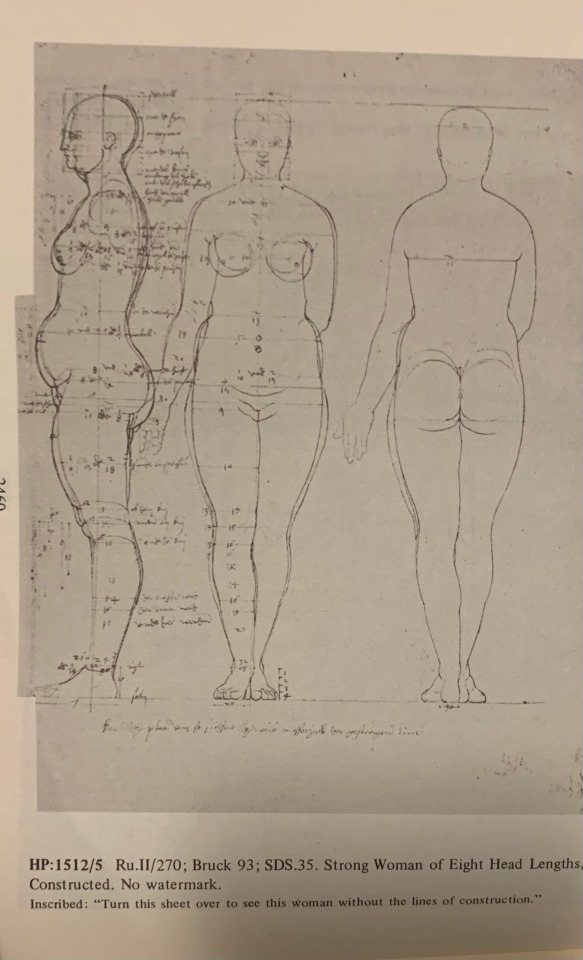
Here’s a “strong woman” and “A very strong, stout woman”
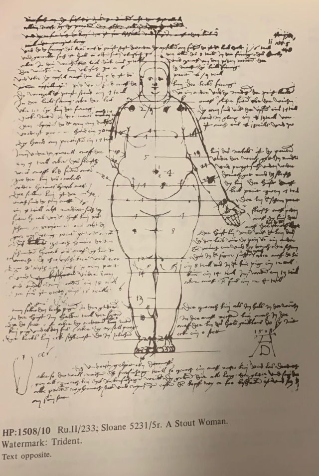
This is what he refers to as a “stout woman.”
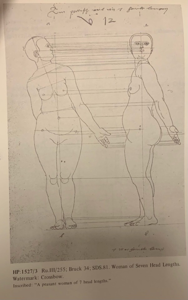
Here’s where it gets interesting: this is what Albrecht Dürer refers to as a “peasant-type” woman
^That. That’s what a “peasant” body type looks like.
He labeled this one “A peasant woman of 7 head lengths”
in case you missed it: this figure drawing by a guy in the 1500’s is literally labeled as being of a peasant woman! this is what a “peasant woman” body type looks like!
He did draw similar amounts of thinner figures, but they’re not particularly emphasized over the “Strong” and “Stout” figures. Nor is there exactly a “default” figure. He’s just…going over the range of variations that there are?
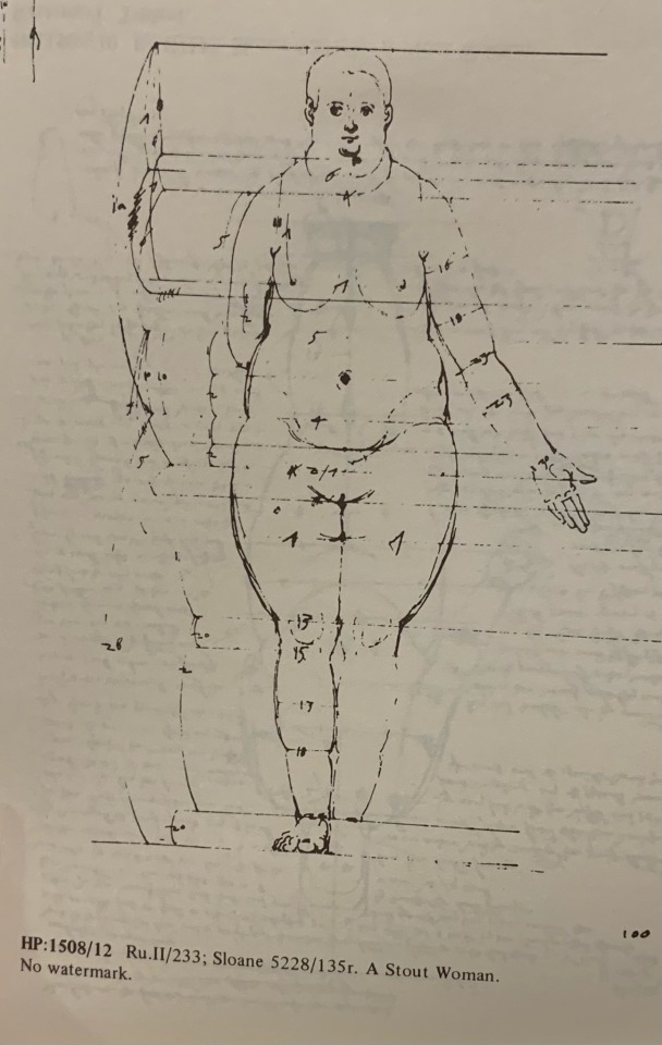
Here’s another “stout woman,” covered in notes on how to draw the proportions:
now that’s too technical for me to make any sense of but
this was in the 16th century!! This body type was apparently not incredibly rare in the 16th century. This body type was important enough for you to be able to draw, as an artist, in the 16th century to be handled in detail in a 16th century artist’s drawing advice
In conclusion: yes this is just what people look like, yes it’s important to know how to draw fat bodies, even this dude from the early 1500’s is telling you so, Die Mad About It
all of this is from “The complete drawings of Albrecht Dürer” by Walter L. Strauss
A man walks down a street with a turned upside down mural inspired on “The Praying Hands” by artist of the Renaissance Albrecht Durer, in Athens (AP Photo/Daniel Ochoa de Olza)
Available NOW: my new screenprint “March To The Sea”. A part of this was used for the poster of last Euro tour of Baroness, now available in full through the wonderful people of Burlesque of North America
MAIN EDITION:
18 x 24"
10 color screenprint on French Whitewash paper
signed, numbered, and embossed edition of 65 prints
$65 + shipping
VARIANT EDITION I:
18 x 24"
10 color screenprint on French Starch Rain paper
signed, numbered, and embossed edition of 26 prints
$75 + shipping
VARIANT EDITION II:
18 x 24"
11 color screenprint on French Brown Wrap Kraft Paper
signed, numbered, and embossed edition of 16 prints
“Flycatchers” are finished, I will bring these among other OG’s with me to the art show @theconventphilly on August the 24th: epic event with long time friends John Dyer Baizley & Jeremy Hush & Burlesque of North America (more news on this coming soon!)
Rounding this one up: had to balance things out & do some personal work, before diving into more “Metal”-projects. No title yet, feel free to put your 2 cents in, thanks!
Finishing the shirt design for Mortuous. This was based on Clint’s ideas: Chrysalis of Sorrow Concept:
A person cocooned (the Chrysalis of Sorrow) in their own misery & suffering, isolated from the world around them and surrounded by ghosts & memories.
I’d like the cocoon symbolize the protective nature of the mind - to secure itself from reality. In this case as a metamorphisis into the spirit of oneself transcending into a realm beyond.
I’m imagining to connect the artwork to the LP artwork, the Crysalis can be hanging off of a branch, or even shrouded by the branches similar to the kind of tree drawn on the album.
Darker colors come to mind, like purple/blues, greens, browns, etc.,
Lyrical focus on the concept: Slipping through anguish, Pain, and defeat, Sorrow of loss, Control out of reach, Misery consuming, No signs of relief Behold the depression, swallowed in grief
I basically stayed with the concept but had to ditch the “surrounded by ghosts & memories” part, I added the geometric maze from the album cover in the background; a structured, constructed labyrinth, forces you to follow a path to no where, e.g. society.
The color scheme is based on these lyrics: “orange is for anguish, blue for insanity”. I planned to use that color scheme for the album cover but had to forfeit that plan, when the art made different demands: look down my feed for the album cover in different stages/colors. I’m glad I finally got to pull of these colors in a convincing way. Make sure you check out @mortuous : record release show tomorrow, preorder up on Carbonized Records Tankcrimes Dawnbreed records & catch them live on their August West Coast tour!
Proud to reveal the art I did for REVOLVER Magazine: the new issue revolves around Ghost and their new album Prequelle, with 5(!) different covers, my version exclusively available in the box set, that collects the all. On newsstand June 19, for a look inside the magazine: link in the bio of @revolvermag. Thank you so much @jimmyhubbard @revolvermag for this opportunity & all the artistic freedom, trust; I think it has paid off!
Finishing the “handwork” stage of the cover art for Lucifuge debut album. Glad to work with my old punk buddy Juanmi on a project again, up the metalpunx!


![Dürer, Morte di Orfeo (1494)[…]Lo ammazzarono, sacrileghe, e da quella bocca ascoltata dai s](https://64.media.tumblr.com/0154d6a96768588fb4e66b3a6a12eb99/tumblr_o4epoh5C9T1so5yd3o1_1280.jpg "Dürer, Morte di Orfeo (1494)[…]Lo ammazzarono, sacrileghe, e da quella bocca ascoltata dai s")
")