HEY THIS IS IMPORTANT whats your favorite place to find drawing references?
so far we’ve got
senshi stock
croquis cafe
line-of-action.com
quickposes.com
posemaniacs
clip studio paint models
pexels.com
sketchdaily
eggazyoutatsu atarichan drawer
designdoll
if you have any more please reply!
Unsplash: All photos published on Unsplash can be used for free. You can use them for commercial and noncommercial purposes. You do not need to ask permission from or provide credit to the photographer or Unsplash, although it is appreciated when possible. More precisely, Unsplash grants you an irrevocable, nonexclusive copyright license to download, copy, modify, distribute, perform, and use photos from Unsplash for free, including for commercial purposes, without permission from or attributing the photographer or Unsplash. This license does not include the right to compile photos from Unsplash to replicate a similar or competing service.
Freeimages: You can use the images in digital format on websites, blog posts, social media, advertisements, film and television productions, web and mobile applications. In printed materials such as magazines, newspapers, books, brochures, flyers, product packaging for decorative use in your home, office or any public place or personal use. The rights granted to you by FreeImages.com are: Perpetual, meaning there is no expiration or end date on your rights to use the content. Non-exclusive, meaning that you do not have exclusive rights to use the content. FreeImages.com can license the same content to other customers. Unlimited, meaning you can use the content in an unlimited number of projects and in any media. For purposes of this agreement, “use” means to copy, reproduce, modify, edit, synchronize, perform, display, broadcast, publish, or otherwise make use of.
Stocksnap: Every single image on StockSnap are governed exclusively by the generous terms of the Creative Commons CC0 license. Specifically, that license means you can do any and all of the following: Download the image file.Publish, revise, copy, alter, and share that image. Use the image (as-is or as you’ve altered it), in both personal and commercial contexts. Moreover, you can put StockSnap CC0 images to any of these usages without buying the right to do it, acquiring written permission from the image’s creator, or attributing the work to the image creator. In other words, there’s no fee to download or use these StockSnap images in accordance with the CC0 license. They’re free to download, free to edit, and free to use - even in a commercial project! You don’t even need to attribute the image to the creator, the way you do with other CC or traditional copyright licensing schemes. (However, even though it’s not required, we here at StockSnap do encourage you to include an appropriate attribution. It’s a nice thing to do.)
Burst.Shopify: Burst is a free stock photo platform that is powered by Shopify. Their image library includes thousands of high-resolution, royalty-free images that were shot by their global community of photographers. You can use their pictures for just about anything — your website, blog or online store, school projects, Instagram ads, facebook posts, desktop backgrounds, client work and more. All of their photos are free for commercial use with no attribution required.
Pixabay: Images and Videos on Pixabay are released under Creative Commons CC0. To the extent possible under law, uploaders of Pixabay have waived their copyright and related or neighboring rights to these Images and Videos. You are free to adapt and use them for commercial purposes without attributing the original author or source. Although not required, a link back to Pixabay is appreciated.
Viintage: All images hosted by Viintage.com are considered to be public domain images, each image is presumed to be in the public domain. It may be distributed or copied as permitted by applicable law. Viintage.com assumes no ownership of the images and they may be downloaded and can be used free of charge for any purpose. They may be downloaded and used for commercial and personal use. Understand “public domain” as the permission to freely use an image without asking permission from the photographer or the illustrator. Thus, the creator of the work will not sue you for violating his/her copyrights. It is your responsibility to make sure, displaying the image does not violate any other law. Viintage.com assumes no responsibility for how or where you use the images found on the site.
Gratisography: You may use Gratisography pictures as you please for both personal and commercial projects. You can adapt and modify the images and get paid for work that incorporates the pictures. This includes advertising campaigns, adding your logo or text to an image, printed in any size print runs (e.g., book covers, magazines, posters, etc.), on your website, blog, or other digital mediums, and on merchandise as long as the picture itself is not the merchandise.
As someone who draws a lot of faeries, Faestockis godlike.
A wonderful addition to the list!
Unsplash. Another whopping huge free images site like pixabay: free for commercial and noncommercial use and remixing; just don’t sell the photos unmodified or add them to other photo-sharing sites.
Morguefile.Big old free photo archive from the dawn of the web. “We are a community-based free photo site, and all photos found in the Morguefile archive are free for you to download and re-use in your work, be it commercial or not. The photos have been contributed by a wide range of creatives from around the world, ranging from amateur photo hobbyists to professionals.”
Open Access at the Met. The Metropolitan Museum of Art in New York: “Whether you’re an artist or a designer, an educator or a student, a professional or a hobbyist, you now have more than 406,000 images of artworks from The Met collection to use, share, and remix—without restriction.”
Smithsonian Open Access. Download, share, and reuse millions of the Smithsonian’s images […] from across the Smithsonian’s 19 museums, nine research centers, libraries, archives, and the National Zoo.
Limited use, if you’re doing a Science and need control panels/rockets/futuristic an image search with qualifier site: nasa.gov You have to double-check a photo’s caption it’s really a NASA photo, but photos which were taken by NASA spacecraft and astronauts are public domain, since they’re funded by taxpayer dollars. (This also goes for images of animals archived at the USFWS Digital Library, i.e the US Fish and Wildlife Service, or rocks and landscapes on USGSwebsites.
Okay updating and consolidating lots of info here; as well as adding links for ease of access. Adding a brief description for some too; as is the case that not all of them have descriptions above. (Warning that some of these links contain nude refs, I will try to mark where possible which ones have more prominent ones.)
Posing Sites and Apps:
Adorkastock. Stock photos for pose refs. DeviantArt gallery started in 2007.
FreePhotoMuscle.com. (translated page link click here) Japanese stock photo pose site that includes buff people, but in funny poses and costumes.
CroquoisCafe. (NSFW, nude model poses warning) A stock photo pose site. You should be aware this org has been linked as pro-Trump. I leave it to y’all to decide if you want to use the resources or not. I highly encourage not financially supporting them and trying to support the individual models if you can.
Line of Action. Fantastic site that includes posing refs, community discussions from other artists, figure study, anatomy, etc. So much stuff in here.
PoseSpace. Extensive library of poses. Some free resources others are paid. I’ve not fully evaluated both, but you should be able to use this all mostly free and get great use out of it.
SketchDaily. This one is one of the better ones out there. You can time yourself, search by pose, clothing options, body type, perspective, etc. All real models.
JustSketch.me. A pose app for any device. Has apps for most devices and a webapp. Customize and pose models/props/scenes.
Quickposes. Pose site that gives you timed challenges to become more proficient at poses.
POSEMANIACS. Ref site with anatomical poses. All the ref pics are of 3D models with only the bones and muscles. Can be helpful for seeing how muscles behave in certain poses. limited to two body types tho.
MagicPoser. A wonderful app that’s great on mobile. Lets you choose size of models, number of them, style, etc. Significant features are use of snap point with the physics engine, adjustable lighting, multiple perspective, 360 angle, articulated hand posing.
Clip Studio Paint Modeler. Free 3d tool that works with Clip Studio Paint. You can import your own data or other models you find online. Not quite an alternative to Blender, but the integration with CSP is very nice.
Egg a Zyoutatsu Atarichan Drawer. (requires enabling flash player or downloading and using standalone flashplayer) Drawing tool for pose practice. The developer is working on an html5 version.
DesignDoll. One of the best pose tool apps out there. You can customize so many things. They also have an extensive collection of ready made poses here. You can use the free or pay once for life and have the poses integrated into the client as well as the ability to export your obj to other programs like blender or smt.
freeimages.com. Another stock photo site, less features than some others.
StockSnap.io. Stock photos with a creative commons CC0 license, which essentially means you can use the photos however you want and don’t have to attribute to them. (though its nice if you do attribute)
Burst.Shopify. Tons of royalty free high quality images. Similar licensing to StockSnap.
pixabay. I feel like most people know about this one, but it features entirely free CC0 licensed Photos, Videos, and Music. No attribution required, but still nice to support a giant site with all this content.
Viintage. Big collection of public domain vintage photos.
Gratisography. For commercial or personal use. They specialize in odd, quirky, wild stock photos.
pexels. Great free stock photos and videos. Only a few stipulations of what they don’t allow, but their license info can be found here.
Faestock. An artist and model with a huge amount of fantasy and fae and other types of photos available. Their terms for use are here.
MorgueFile. Old stock photo archive that’s been around a long time.
- If you were offered to go back in time and try to save your family, would you agree? Would you give your life for their lives?
A small part of the story that my old hunter Felonares was willing to share, answering the question. Featuring my dearie @redhead-trickster‘s Oswald.
I never worked with the comics before and it was a super interesting, but challenging task! I also have some process step materials, so If anyone is interested - please, tell me so and I will post them. :) ___________________________________________________________ If you like my work, please consider:
Marvel movies have completely eliminated the concept of practical effects from the movie-watching public’s consciousness
Not just practical effects just like. Basic set design lol
How… How do they think sci-fi was done before CGI?
Really badly? Do you remember sci-fi before CGI? It was shit. And don’t say Star Wars because they went back and fixed that with CGI later.
*big sigh* *puts head in hands* heathens who’ve never watched pre-MCU sci-fi movies OR the unedited Star Wars movies, my beloathed
So first of all, most people agree that the majority of the “CGI fixes” in the Star Wars original trilogy (excluding minor visual/sound effects like lightsaber colors and blaster sounds) are unececssary, extremely conspicuous, and/or bad. This is not news to literally anyone older than about 20 who has consumed Star Wars content on any level. There are quite literally two very famous ‘despecialized’ fan projects explicitly dedicated to un-doing all of the shitty “fixed” CGI effects while simultaneously restoring the OT in HD.
And yes, I do, in fact, remember sci-fi special effects before CGI was the foundational cornerstone of moviemaking. It was not, in fact, shit:
Also, ironically I can show you by….*gasp* using fucking Star Wars, of all things. Welcome to the Tatooine pod race set of The Phantom Menace, which was not, as popularly believed, CGI’d but was instead a fully-built miniature set:
Yes, they built the entire set as a minature, built life-sized pod racers for the actors, then spliced the two together using digital effects. Yes, they did such a fantastic job that people think the entire set and scene sequence was basically completely CGI’d to this day. You’re fucking welcome for undervaluing the time, effort, and talents of set designers by implying that set design and practical effects inherently mean things will look like shit.
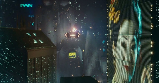
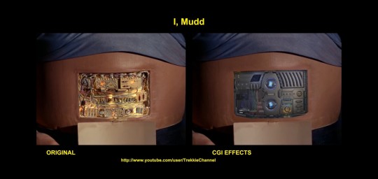
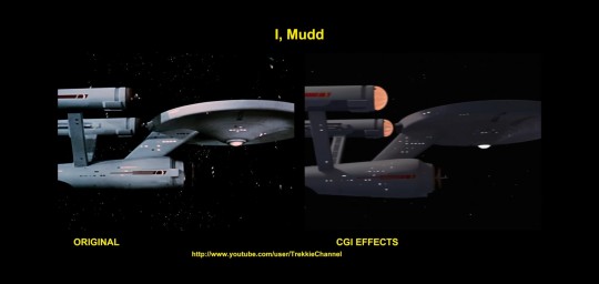
CGI also ages really poorly. What you think looks incredibly realistic now is going to look terrible in a few years. Just look at the original vs remastered Star Trek. They “restored” Star Trek around 2006 and replaced a lot of the practical effects with CGI, and maybe it looked ok in 2006, but it looks so bad and fake now.
In the 60s they built a whole model of the Enterprise, complete with blinking lights and beautifully sculpted/painted details. It looks stunning! Then they replaced it with that horribly smooth and fake looking cgi ship.
Just look at this beauty
You can see the model at the Air and Space Museum in DC
Unfortunately the remastered version is the only version available to stream, but you can still find DVDs with the original effect.
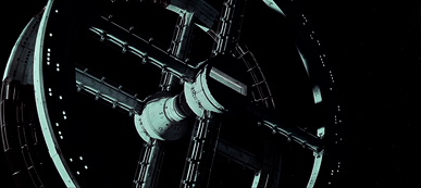
made in 1968 and still stunning 2001 A Space Odyssey
the designers worked with engineers at NASA to make realistic futuristic special effects using models and matte paintings no computer effects at all! - and incidentally inspired David Bowie to write Space Oddity, later performed in space by astronaut Chris Hadfield
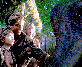
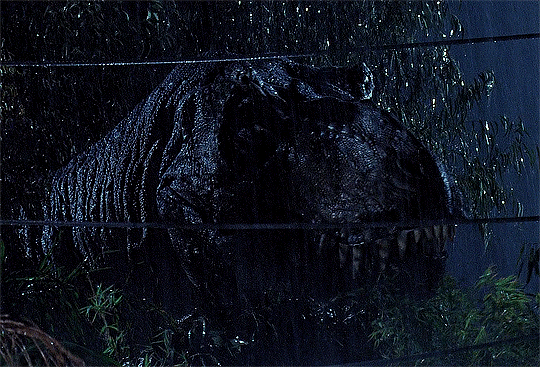
The CGI of the original Jurassic Park may not be aging well (though arguably still better than some), but the practical effects will always look stunning.
I want to talk fantasy.
This shot was achieved with splicing and green screen.
This wild-looking shot (and similar manipulations) was famously achieved by having a professional juggler in a duplicate of Bowie’s jacket and gloves sitting behind him, basically with Bowie in his lap, doing the handwork while Bowie kept his arms behind the juggler. You may have seen a game based on this on Whose Line Is It Anyway.
This? Wires! Splicing! THE CGI TO DO THIS DIDN’T EXIST YET! (The juggler is hidden under the cape. If there’s a scene where he’s wearing a cape, that’s actually probably why.)
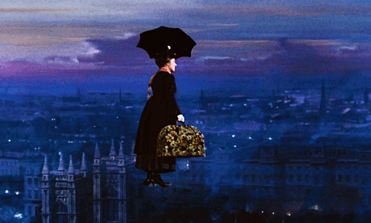
And this? This heartstopping shot?
This does appear to be from the version with CGI—
—CGI THAT WAS USED TO ERASE THE SHADOW FROM THE PRACTICAL EFFECT.
The shot itself hasn’t changed. The lift itself was done with wires and Bowie was given some propulsion with an air cannon so he could make that turn at speed. A minor amount of CGI was used in the 30th anniversary to “touch up” the work done in 1986, and one of the things they did was to remove a shadow on the wall from one of the wires.
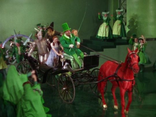
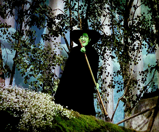
How about this?
You don’t know it, but you’re looking at a practical effect. In real life, the Ruby Slippers are almost orange. That luxe, rich ruby color showed up on the film as black when the shoes were the correct color, so the costumers adjusted the actual costume to give the color they wanted.
A MODEL OF A HOUSE SHOT INSIDE A NYLON STOCKING ATTACHED TO A FAN.
MAN IN A COSTUME.
HORSES DUSTED WITH COLORED GELATIN.
And this? This is where it would’ve been useful to have CGI. Margaret Hamilton got really badly burned on the steam doing one of her entrance/exits, and ended up in the hospital. THIS is what you use CGI for.
You come into my house and insult practical effects?
I’ll just finish off by reminding you THIS IS ONE, TOO.
That last one, iirc, was there was a double in a sepia-toned costume, and the interior door and wall there was painted brown, so when it was lit and shot it all appeared to still be in the sepia tone of the Kansas scenes, and part of why Dorothy stepped back out of the frame was so the double and Judy Garland (in the proper blue-and-white costume) could swap.
You are correct. The double’s name, by the way, was Bobbi Koshay.
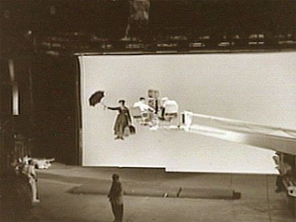
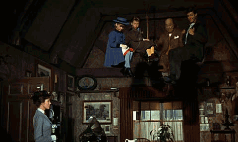
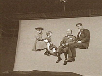
There are so many practical effects in Mary Poppins that it’s unbelievable. Ranging from the big ones (popping through pictures, tea parties on the ceiling, flying with an umbrella, etc.) to the incredibly little details, there’s a big reason why Mary Poppins won the Oscar for “Best Visual Effects” in 1965
I can’t find a list of all effects used, so this is just going off my memory of a documentary I watched once, so bear with me here; some of these things might be misremembered. But, some of the practical effects used in this film:
- Actors suspended on wires
- Scenes filmed front of a white screen lit with sodium vaporlights (early cinema’s “greenscreen” before greenscreen was invented)
- Matte paintings on glass for the cityscape scenes (rooftops of London, St. Paul Cathedral, etc.)
- Animatronics (the robin that whistles with Mary Poppins is an animatronic controlled by a wire, and the movement and sound you see on-screen was what it was actually doing on-set. The talking parrot umbrella head was also an animatronic.)
- Moving set pieces (every time they slide up or down the banister, they’re riding on a mechanized chair-lift hidden from the camera)
- Padded stairs (when they climb up the staircase made of smoke, the actors actually were climbing up a staircase padded with thick styrofoam, so that their feet would actually sink in some. The children found it particularly challenging, prompting Dick Van Dyke and Julie Andrews to offer extra help in keeping them balanced, thus really selling the idea that they are two kids walking on smoke with assistance from their guardians)
- Scene splicing (When she pulls impossibly large items from her carpet bag, she’s pulling them through a hole from under the table. The scene was spliced with footage depicting the table with nothing underneath it - except for Michael, who crawled underneath to ‘examine’ for a hole)
- Hidden compartments in bottles containing liquid of different colors (this one is my favorite lol; the children were not told that the medicine would come out of the bottle in different colors; they were just supposed to complain about taking it. Their reactions of shock and amazement are 100% genuine)
Even tiny details that you wouldn’t normally even think of as “special effects” were paid careful attention to, in order to help sell the story. Such as, during the Supercalifragilisticexpialidocious scene, while Julie Andrews and Dick Van Dyke are dancing and acting their hearts out, the children are supposed to sit on a fence and eat candy-apples. However, after filming for a long time, the kids were sick of the candy apples they’d been eating. So, Disney called for candy-apples made in tons of unique and delicious flavors, just colored to all look the same. It became the children’s favorite thing about the scene: they just got to sit and listen to fun music and watch the adults sing and dance while they tried a hundred different candy-apples, which is why they’re devouring them like little lions every time you see them on-screen.
(Also not so much a practical effect but just cute to note while I’m talking about Mary Poppins: the kids kept actually falling asleep during filming for the scenes in which Julie Andrews sings them lullabies lol)
CGI has its uses, to be sure. But it ought to be used to ENHANCE practical effects, not REPLACE them.
tbh that’s what Coraline is. And pretty much every movie by LAIKA Studios. It’s all filmed with practical effects and then enhanced with CGI.
Practical effects are actually amazing, and the overreliance on CGI makes films look far more ‘fake’ and causes them to grow outdated far more quickly than modern producers want people to admit.
Mainly because set designers and practical effects specialists are UNIONIZED but computer animators are not, making their labor easy to exploit and often leaving them massively overworked and underpaid.
I know I was already here, but since @plushchrome1212 made this incredible addition, I just want to point out this is a gold standard of practical effects work. Like. What I wrote above probably clued you in that I love looking for the man behind the curtain and going “oh, THAT’S how they did that!”
Mary Poppins is my favorite Disney movie. In 33 years, it has never once occurred to me to question how any of it was done. The illusion is so complete, I’m a grownass adult who just. Accepted that they disappeared into the sidewalk.
Can Someone please add the plant puppet from “My little shop of horrors”!?
That special effect was fenomenal and it took 6-8 people to move that puppet!
I’ve heard that many people prefer the purple and green aroace flag to the sunset one, so here’s a few of my prior background themes in the purple and green color scheme (made in WOMBO dream).
Tree of life, lotus flower, starry sky, ocean waves, fireworks, explosion, clouds, waterfall, sunrise
it’s difficult, it’s all just so difficult in a way that doesn’t quite make sense.
we go out to get something to eat together and there’s moment
after moment where i look at your hands or make you laugh and all
i want is more of it, more of those little moments and more,
your eyes on me, my head on your chest,
fingers moving deftly around a knife in a kitchen flooded with light,
something warm and soft and full that stings in a pleasant sort of way.
and it should be easy, i’ve always liked a little blood, always liked
the way a knife glints, always liked how it hurts when people turn away.
but it’s something different altogether, the scene’s washed in
some different kind of light. the actors are moving the same way,
we’re moving the same way, but everything is washed in red and crimson
instead of yellows and blues like it usually is, everything screams
danger and panic and grief, and it’s not familiar. it’s all wrong.
the knife raises and raises and then falls, and halfway down i can
see how it’ll all turn out, see the reflection in the camera lens, and it’s what i always wanted;
a hand reaching out to a flame and getting burned, then recoiling,
something glass and fragile being dropped from a height and shattering,
destruction and desolation and isolation and failure,
all these things i usually wanted, destruction just the way i liked it,
so why is everything crimson? where’s the horror movie soundtrack coming from?
fine, let’s change the scene. we’re on a road trip and i’m driving even
though my hands tremble on the wheel and you’ve got the radio cranked up
and you’re laughing and tossing an energy drink at me
and you look beautiful in the golden hour light and suddenly i’m hitting the brakes
and pulling off to the side of the highway because the gold shifted to crimson again.
this shouldn’t be difficult. it isn’t for everyone else.
they’ve always said it’s what makes us human. so why is it so difficult?
the director shouts again, again from somewhere and the scene shifts once more.
i’m sitting in a room illuminated by a screen your name is on and your voice is
in my ears and i’m laughing, and you’re laughing, and everyone is laughing.
you must notice that something is off because you remind me that you love me, that i’m a great friend,
but suddenly my hands are shaking again, over the keys now, and i hope
you don’t notice how unsteady my voice is when i laugh back at you,
that you don’t notice how the blood seeps out from the hollow of my chest
and trails down my ribcage, each beat twisting the knife a little more.
once more, with feeling, as if just saying that doesn’t wrench open the wound again.
we’re sitting under an old magnolia at the edge of my yard, secluded and rural.
you could scream and no one would hear you, you tell me,
and so i scream, and keep screaming, til my throat’s raw and
everything comes out red and half-gurgled. i scream and you look at me
and hold out a magnolia blossom, and we lie there together under the branches
in the hot july heat, waiting for the bad feelings to be chased away,
the knife cast away and left to rust in the tall grass somewhere else.
but that’s still not right.
but now i’ve pushed too hard and something’s wrong with the lighting on set,
crimson to green and grey and white, everything’s flashing and it’s hard to think,
and i think i see someone’s face, and i think they’re good and lovely and beautiful,
but everything is flashing and i can’t be sure, because everything is flashing
and my head is pounding and it’s too difficult to put a name to it.
what i’m feeling must be fear, but which kind? what i’m feeling
must be panic, but in what way?
when i see their face, am i afraid because i want something normal and friendly?
when i see their face, am i afraid because i want something else?
i keep trying to ask but the lights keep flashing and nobody answers.
this page of the script is blank and the director is shrouded in shadow and unresponsive.
tell me, which is it? is it love or not? can i feel love or not? can i be loved or not?
but there’s nobody working on set and i don’t know how to make the lights stop flashing.
the way they blend into each other, the way the crimson always finds a way to peek through the rest,
the way it’s all so overwhelming and god damn it’s so hard to think.
it’s supposed to be what makes us human. how are you supposed to know?
how can anybody know when it’s like this? are the lights flashing for everyone else?
fondness either grows or festers, then it’s shoved into my arms
and i have to figure out what to do with it. how am i supposed to know what it even is when the lights keep flashing?
i want to have someone, i want to be certain,
i want the scene to be holding hands in a well-lit room instead of being blind in the dark,
i want light, and i want gold, and i want the bad feeling to stay away.
-
hi, i’m ic and i’m grey-aromantic.
i’ve been feeling and thinking a lot about what that means to me lately, and figured that valentine’s day is as good a day as any to make a bit of that public, partly because i know i appreciated reading about other people’s experiences when i was trying to figure shit out, and partly because i’ve had this on my mind for so long that i kinda just want to share it.
until recently, i never had crushes. as a kid, i always figured i’d have a high school sweetheart, or find someone who makes me nervously excited with just a look eventually. and then i didn’t. for a while i thought i was aromantic, but when i found the term grey-aromantic (or grayro), something just clicked. here was a word for what i’d been feeling, or maybe what i hadn’t been feeling. here was validation for never having dated or had a crush, for feeling drawn to people but being uncertain regarding whether it was platonic or not, for having such a strange relationship with relationships.
a little over a year ago i started reading up on grey-aromanticism and felt that click. i finally stopped lying and telling myself i was completely aromantic (which was partly because of low self-esteem and partly because i’d never had a crush, which isn’t to say that aromantics are invalid because they’re just sad, not at all; that was merely my experience), and told myself that if i felt drawn to someone, i’d genuinely explore it instead of shutting it down like i had before.
onemaybe-a-crushand oneprobably-almost-certainly-a-crush later and my perspective has changed a bit, especially after the former. it made me realize that a significant part of me, in spite of all the anxiety and self-image issues, actually wants a partner. which sounds lame but as someone who spent a long time convincing myself i’d never have or deserve that, it feels nicer than i expected.
so yeah. happy valentine’s day, especially to my ace/aro spectrum folks. you’re not broken, no matter what a holiday might try and claim.
[image description: three sets of two lockscreens featuring a design of repeated arrows banded in the colours of various aromantic spectrum pride flags. The left lockscreen features the arrows set against a gradient background matching its respective flag colours; the right features the arrows set against a plain white background. Flags included are: pomoromantic (light pink gradient/white/mint green/white/light pink gradient), queerplatonic (yellow/pink/white/grey/black) and thelo aro-ace (purple-pink/white/yellow/green/navy).]
I’ve turned my aro arrows into lockscreens! All backgrounds/wallpapers are available for free personal or non-commercial use. For flag creator credits, please see @aroflagarchive.
Welcome to the seventh edition of #AggressivelyArospecWeek!
#AggressivelyArospecWeek (#AAW) is a week-long event promoting the creation of arospec fancontent by arospec creators. (Arospec = on the aromantic spectrum. If you’re currently questioning whether you are yourself arospec, please feel free to join as well.)
Our event aims to create a space where arospec creators are free to explore their identities through fanwork. We believe that fandom is a great way to share our passions, our interests and to empower one another in our arospec identities. All while having loads of fun!
Please join us from June 19 to June 25 2022 and enjoy a small explosion of arospec fancontent on you dash. Bring it to other people’s dash and help our community share its stories!
You’re welcome to submit any type of content for the event, whether it be fanfic, headcanons, mixtapes, fanart,… Really anything goes!
Any content you submit must be centered around a character’s arospec identity (whether that character is canonically arospec or you headcanon them as such.) Content can be about any fandom whatsoever!
To submit, please make a new post between June 19th and the 25th and tag it as #AggressivelyArospecWeek. You can also submit your work directly to our blog through the askandsubmission boxes. Your post will then be shared on the Aggressively Arospec blog.
We also have a Twitter account, so use the hashtags #AggressivelyArospecWeek and #AAW22 if you tweet about your work on there. You can also mention us in your tweet (@ AArospec) to be sure we don’t miss it and can retweet it. Please, do submit through tumblr if you can though! That is the best way to get your contribution archived with all the others.
Lastly, a collection will be opened on Archive of our Own to round up all the fanfics posted on there. Just search for “Aggressively Arospec Week ‘22″.
We can’t wait to see what you have in store for us this year!
(For more information, check out our About page or our FAQ section. If you need some inspiration, you can also check out the content that was created during out previous events in our #AggressivelyArospecWeektag.)
[image description: six different cartoon-style bunting graphics, featuring six pride flags hanging from a brown rope. The flags are rectangular, finishing in a chevron shape, and have rows of brown stitching across the top of the flag and along the bottom of the chevron. First image in each set shows the flags with the topmost stripes facing the left; second image shows the three right-hand flags flipped, so all topmost edges face away from the centre of the bunting.
The first flag on each banner is an aromantic spectrum identity and alternates with the corresponding asexual spectrum pride flag. Banners in descending order: askepsiromantic and askepsisexual, cupioromantic-flux and cupiosexual-flux, delloromantic and dellosexual, demiromantic and demisexual, intrusiromantic and intrusisexual, nullumromantic and nullumsexual.]
Aromantic and Asexual Bunting
Flags: Askepsiromantic and Askepsisexual, Cupioromantic-Flux and Cupiosexual-Flux, Delloromantic and Dellosexual, Demiromantic and Demisexual, Intrusiromantic and Intrusisexual, Nullumromantic and Nullumsexual.
Free to use with credit to one of my accounts. Original files are available to download from my Aro Worlds Patreon or my Aro Arrows WordPress site.
[short image ID; nine cute drawings of manta rays, all identical except for the colors, which are colorpicked from pride flags. The flags are loveless aromantic, lovequeer, aromantic allosexual, sapphic, polysexual, aromantic spectrum, angled aromantic asexual, demiboy, and cupio. End short image ID]
[image description: three sets of two lockscreens featuring a design of repeated arrows banded in the colours of various aromantic spectrum pride flags. The left lockscreen features the arrows set against a gradient background matching its respective flag colours; the right features the arrows set against a plain white background. Flags included are: alterous (yellow/grey/pink/red), demi aro-ace (navy/light blue/black/white/light grey) and nebularomantic (purple/dark blue/teal/white/peach/dark coral/violet).]
I’ve turned my aro arrows into lockscreens! All backgrounds/wallpapers are available for free personal or non-commercial use. For flag creator credits, please see @aroflagarchive.
[image description: five pixel art icon sets of the lower case letters “a”, “c”, “d”, “f” and “i” surrounded by a square frame in alternating flag stripes on a grey or black background. Each icon is in a set of two, one image with a white border and blank space surrounding it to resemble a sticker, the other without. Sets in descending order: aro-ace (green/light green/white/pink/violet), cass aro-ace (black/olive/peach/coral/blue), cupioflux (light lavender/lavender/grey/pink/light pink), demi aro-ace (black/dark blue/white/grey/black) and inaequic aro-ace (orange/bright yellow/white/light green/dark green).]
A, C, D, F and I are for Aro: Pixel Art Letter Icons
[image description: three sets of two lockscreens featuring a design of repeated arrows banded in the colours of various aromantic spectrum pride flags. The left lockscreen features the arrows set against a gradient background matching its respective flag colours; the right features the arrows set against a plain white background. Flags included are: alterous (yellow/grey/pink/red), demi aro-ace (navy/light blue/black/white/light grey) and nebularomantic (purple/dark blue/teal/white/peach/dark coral/violet).]
I’ve turned my aro arrows into lockscreens! All backgrounds/wallpapers are available for free personal or non-commercial use. For flag creator credits, please see @aroflagarchive.