#materials


19-4052 Classic Blue – The Pantone Colour of the Year 2020. Image credit: Pantone.
By Anthony Caggiano
“We are living in a time that requires trust and faith.”
Pantone Colour Institute Executive Director, Leatrice Eiseman, used the line to help frame the direction as to why 19-4052 Classic Blue was chosen as the Pantone Colour of the Year 2020.
Eiseman said this particular colour is a solid and dependable hue that expresses constancy and confidence.
‘A boundless blue evocative of the vast and infinite evening sky, Classic Blue encourages us to look beyond the obvious to expand out thinking – challenging us to think more deeply, increase our perspective and open the flow of communication.’
Since 1999, the Pantone Colour of the Year has helped shape product development and buying in areas including fashion, home furnishing, industrial design and packaging.
It is chosen by the Pantone Color Institute, the business unit within the company.
So what are some of the areas that we might be able to expect to see the colour popping up? We take a look at some areas where we’ve seen things.
Fashion
Designer Demna Gvasalia used the hue in his Balenciaga Spring collection, which was displayed at Paris Fashion Week. While the shapes looked at uniforms and had very square structured shoulders, the colour appeared in the stage and a number of items in the collection.
Product Design
A number of the Red Dot Design 2019 winners had blue hues to them.
The CHARGEit powerbank, made by SACKit ApS, Denmark, wirelessly charges smartphones, loudspeakers and other mobile devices placed on the “X”. Its design includes a rounded aluminium frame surrounding and woollen upholstery fabric, of which the on-trend colour is in the palette.
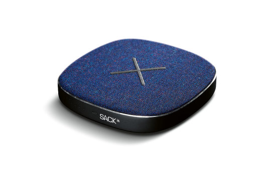
Image credit: Red Dot/Sackit
The Pocket Sky by Active Wearables GmbH, Austria, is worn like a pair of glasses. According to Red Dot, the wearable produces a soft blue light which, similar to daylight, reduces the production of melatonin for the user.
‘The sleep-wake rhythm, wakefulness and general well-being are improved. Pairs of magnets, plated with gold, help the arc to fold and glide into its dock,’ they said. The jury said with the use of blue light, ‘the wearable device increases the well-being of users in situations of stress affecting the biorhythm.’
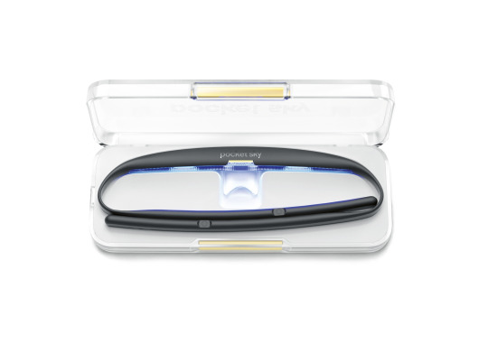
Image credit: Red Dot/Active Wearables
Packaging
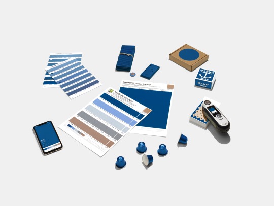
Classic Blue colour swatches and packaging products. Image credit: Pantone
Pantone said because of the colour’s relation to the sky at dusk, something we see every day, it maintains a perception of dependability and constancy.
“Classic Blue is an ideal shade for many applications in graphic design. This is especially true for packaging, where PANTONE 19-4052 Classic Blue conveys the message of credibility and reliability that today’s consumers are connecting to,’ the company said.

PET Blue Ocean Image credit: Seufert Transparente Verpackungen
At Packaging Innovations 2019, London, UK, Seufert, Germany, was awarded ‘Most Innovative Pack’ for its PET Blue Ocean Material, which has a blue hue and has up to 100% recycled content in the central layer of the polyester.
The manufacturer credited the material’s bluish tint to it conveying ‘freshness and purity to the consumer, setting products in an attractive light at the point of sale.’ The material can also be recycled as a mono film.
Q. What have you seen that is blue this year? Tell us in the comments box below.
Merry Christmas and Happy New Year! Chris reads the first page of “The Secret Commonwealth” by Philip Pullman and recommends everyone reads His Dark Materials trilogy for British English.

A selection of evaporation sources in our cleanroom. Evaporation is a thin film deposition technique where the material is heated up to above its melting point in vacuum, typically using an electron beam. The molten material evaporates and is redeposited on your samples which are positioned near the source. Common materials that can be deposited using this technique include gold, copper, titanium, platinum, nickel, iron, silicon dioxide, and carbon.
Post link

I spent part of the day today spinning photoresist. Photoresists are light sensitive chemicals used in photolithography. They are spun onto the sample at high speeds, using a tool like the one in the picture, to ensure an even coat. Yellow lighting is used in rooms dedicated to resist application and processing to prevent it from getting exposed. Once the resist is applied, a pattern can be transferred to your sample by exposing only certain areas to light.
Post link

Aluminum target for our sputter system. If you look closely you can see individual crystal grains.
Sputtering is a technique used to deposit thin films of material. The material source is called a target because it is bombarded with high energy atoms which remove bits of material that are then redeposited on your sample or wafer. The ring is a result of the magnetic field confining the plasma to that region.
Post link

Discarded AFM tips.
Atomic Force Microscopy, or AFM, is a technique by which a small mechanical probe is scanned across a sample to create a height map. This technique has very high resolution, less than a nanometer, depending on what kind of tip is being used, and can be done in ambient conditions (no need for vacuum). AFM is useful for getting roughness data and measuring film thickness, and can be combined with other microscopy techniques to get a complete picture of your device.
AFM probes often get damaged or dirty, resulting in “tip graveyards” like the one shown here.
Post link

Sample stage controls for an ion mill, allowing for rotation about two different axes.
Ion milling is a type of dry etch process used to remove parts of a sample by bombarding it with ions, typically argon, in a vacuum chamber. It can be thought of as an atomic sand blaster. Ions (the “grains of sand”) physically expel, or sputter, chunks of material from the surface. The sample is rotated to ensure uniform coverage.
Post link

Patterned silicon wafers in the clean room.
Photolithography is a technique similar to photography used to make very small micron (~0.00004 inch) sized features. Wafers are coated in light sensitive chemicals called photoresist and then certain areas are exposed to light to create a pattern. The processing room is lit with yellow light to avoid exposing the resist. Photolithography is commonly used to make integrated circuits in electronics, but it is also used in basic research in fields such as physics, material science, engineering, and even biology.
Post link

A sputter system in our lab.
Sputter deposition is a fabrication technique used to deposit thin films of a particular material onto a sample. The film can then be patterned using lithography into, for example, electrical contacts for your device. It is commonly used in the semiconductor industry to make integrated circuits.
First a gaseous plasma of ions, typically argon, is created in the sputter chamber. Ions in the plasma are then accelerated into a large piece of the material to be deposited, called the target, causing atoms to be ejected from the surface. Atoms that reach the sample or substrate are redeposited, forming a thin film over time.
Post link

Platinum plasma in our sputter system.
Plasma is the fourth state of matter (in addition to solids, liquids, and gases) that can be best described as an ionized gas. It is a high energy state, in which there is sufficient energy to strip electrons from atoms or molecules in a gas. The plasma glows because when the electrons recombine with atoms, energy is released in the form of light. The color of the light depends on the composition of the plasma. The plasma in this picture is purple mainly because of the argon ions used to bombard the platinum.
Surprisingly, even though plasma is probably one of the least known of the states of matter, it is the most common in the universe. Examples of plasmas encountered in nature include lightning, some types of flames, nebulae, and stars.
Post link


What’s Reflection.
- Helmut Lang, Spring/Summer 2004.
- John Chamberlain, Trumpery Praxis, 1984.
Post link
Why This 3D Light Printer Is A HUGE Game Changer | Seeker
Computed Axial Lithography is the first printer of it’s kind. It can shape objects, all-at-once, using specialized synthetic resin and rays of light.
For more follow | 4 your brain |
Don´t forget to activatenotifications(click here to see how) !


Kirstie van Noort’s interestingly textured and meticulously pigmented ceramic creations is part of an inspiring process of seeing design as a means to communicate the story behind a material. She has traveled multiple times to research the influences of different industries over landscapes and their unique colors. Through her detailed tests and experiments, she has come up with thoughtful concepts that illustrate the importance of understanding where certain products come from. http://kirstievannoort.nl/
Post link


Photographs from turnerprize entry Assemble as featured at the tramway in glasgow 2015 Assemble worked with the Granby Four Streets CLT and Steinbeck Studios to present a sustainable and incremental vision for the area that builds on the hard work already done by local residents and translates it to the refurbishment of housing, public space and the provision of new work and enterprise opportunities. assemblestudio.co.uk
Post link

I recently partnered with @abernadette11 to create these impact detail sheets and showcase the impact of their designs and production process. A.Bernadette uses upcycled materials, and works with artisans in Uganda to create their versatile products. Please reach out to me if your brand is interested in these type of detail sheets, branding services or any other partnerships. | http://www.mariekheffernan.com/partnerships. | #mariekheffernan #brandingservices #impact #detail #sheets #marketing #design #abernadette #upcycle #recycle #materials #artisan #uganda #sustainablefashion #ecofashion
Post link

materialsscienceandengineering:
Tunable and mechanically robust ferroelectric ionic plastic crystals
New research by a group from Hokkaido University in Japan has shown that the plastic ionic crystal, quinuclidinium perrhenate, has ferroelectric properties and can serve as a model for finding new plastic ionic crystals that demonstrate ferroelectricity with directional tunability. Their work appears in Nature Chemistry.
Ferroelectric materials are spontaneously polarizable. The polarity of ferroelectric materials can be reversed by placing the material in an inverted external electric field. This ability to switch the material’s polarity has been used for several applications including memory devices. Organic ferroelectric materials, in particular, are of interest because they are non-toxic and easier to make than their inorganic counterparts.
However, there are several obstacles to practical application of organic ferroelectric crystals. Each crystal in a substance can be polarized only along its polarization axis, which is dependent on the molecular dipole orientation within the crystal. For effective performance of ferroelectric materials, the polarization axis of the individual crystals in a substance must align in a particular direction. In contrast to the high symmetry seen in inorganic ferroelectrics, the low symmetry in organic crystals has made it difficult to fabricate ferroelectric materials with their polarization axes aligned in the desired direction.
Post link
Harvard researchers have designed a new type of foldable material that is versatile, tunable and self actuated. It can change size, volume and shape; it can fold flat to withstand the weight of an elephant without breaking, and pop right back up to prepare for the next task.

~ competition goody bag from Cass Art

Still have this faux fur trimming. It’s super soft and feels great. Thinking of using this for the small coin pouches and the rabbit hides for bigger projects. Also its.good liner material for bracers or cuffs.
#leather #leatherwork #fauxfur #fakefur #liner #trim #futureproject #futureideas #soft #accessory #accessories #coinpouch #materials #bracerlining
https://www.instagram.com/p/ByNkgDpgBdF/?igshid=wan7v3ty57fh
Post link

Magnesium oxide single crystals growing on Mg. Courtesy of Anasori Babak, Materials Science and Engineering Dpt, Drexel University, Philadel
Post link

materialsscienceandengineering:
The history of petrochemicals and their impact on global geopolitics
All aspects of people’s lives are now bound to a “seemingly unlimited supply of cheap and readily disposable” petrochemicals, a new essay argues.
Global demand for petrochemicals continues to outstrip increases in production capacity, despite substantial expansion in production in China and the Gulf.
The piece, written by Professor Adam Hanieh from the University of Exeter, describes how the synthetic production of petroleum drove post-war revolutions in productivity, labor-saving technologies and mass consumption.
From the 1950s onwards, an array of naturally derived substances—wood, glass, paper, natural rubber, natural fertilizers, soaps, cotton, wool and metals—were systematically displaced by plastics, synthetic fibers, detergents and other petroleum-based chemicals.
The growth of plastics at this time was possible thanks to the growth of the chemical industry in Germany and the U.S. in the early 20th century. By the end of the Second World War, the US was the dominant global chemical power.
Post link


“Charlotte McCurdy creates “carbon-negative” raincoat from algae bioplastic”
____
‘After Ancient Sunlight’ project - by Charlotte McCurdy - Rhode Island School of Design - ‘Nature, the Cooper Hewitt Design Triennial’ exhibtion
____
Arthur and Puff are everywhere …
Facebook | Instagram | Twitter | Tumblr
Post link


Portraits At The Pub - Kate
Portraits At The Pub – Kate
Last session of the year, and we had Kate sitting for us. As usually a mixture of styles, only did three pieces but luckily all three were keepers. Wasn’t totally happy with the large Neocolor 2 piece ‘Starry Night’ this time, but I liked the face and the wine glass. And another good white on black drawing – this time with a chunky Woody Pencil! I do like to make it hard for myself….
Kate,…

Portraits at the Pub 18: Ian
Portraits at the Pub 18: Ian
Ian, Portraits At The Pub, Caran D’ache Neocolor 2 and wash, A4 Acrylic Paper.
This week’s Portraits at the Pub was a convivial affair, and I got some good work done with some new paper and some old crayons. Looking back at the work it’s like the life drawing of old, the regular comment that it looks like the work of several different artists (why I used to say I had no style). Remember the…

Portraits At The Pub - Trudie
Portraits At The Pub – Trudie
After a month away from Portraits At The Pub, it was a little scary – mostly because next to Trudie was the resident Lamb Skeleton (yes they have one) dressed in Halloween attire of a top hat and weirdly a heart cushion in their rib cage. I guess it’s the skeleton’s favourite time of year! Trudie was wearing her wedding dress, so it looked like some spooky wedding so the first drawing was a nod…


It’s #MarchMeetTheMaker
Day 28: Organized
I do try my best to stay organized, especially with my craft items! Not to say that they don’t sometimes look like they’re exploded throughout the house, because that’s definitely true! (Thankfully I have an easy-going husband)
➰These shots are from within my craft closet in our master bedroom. Someday I hope to have an entire craft room (bucket list item for our next house!) but until then, I am quite thankful for this little creative space to call my own!
.
.
.
.
.
.
#fibreandfabrics #meetthemaker #materials #organized #craftcloset #fabricstash #buttons (at Fibreandfabrics)
Post link

Day 20: Tools & Materials
Here is a bit of what I use to create over here! Not shown (because there was no good light on that side of the room) is my ball winder and swift, which I love to use and makes me able to feel more organized, and also my scale to weigh yarn, packaging, my cat….etc. ,
➰ You can tap the photo to see where my tagged items came from! I’m super excited to use the comic book style fabrics shown there in a future Spring/Summer project!
.
.
.
.
.
.
#fibreandfabrics #meetthemaker #tools #materials #yarn #notions #MarchMeetTheMaker (at Fibreandfabrics)
Post link


